Flexbox is an intuitive addition to CSS that allows elements to align and space based
upon the style elements of their container. To use flexbox, the container element must have the
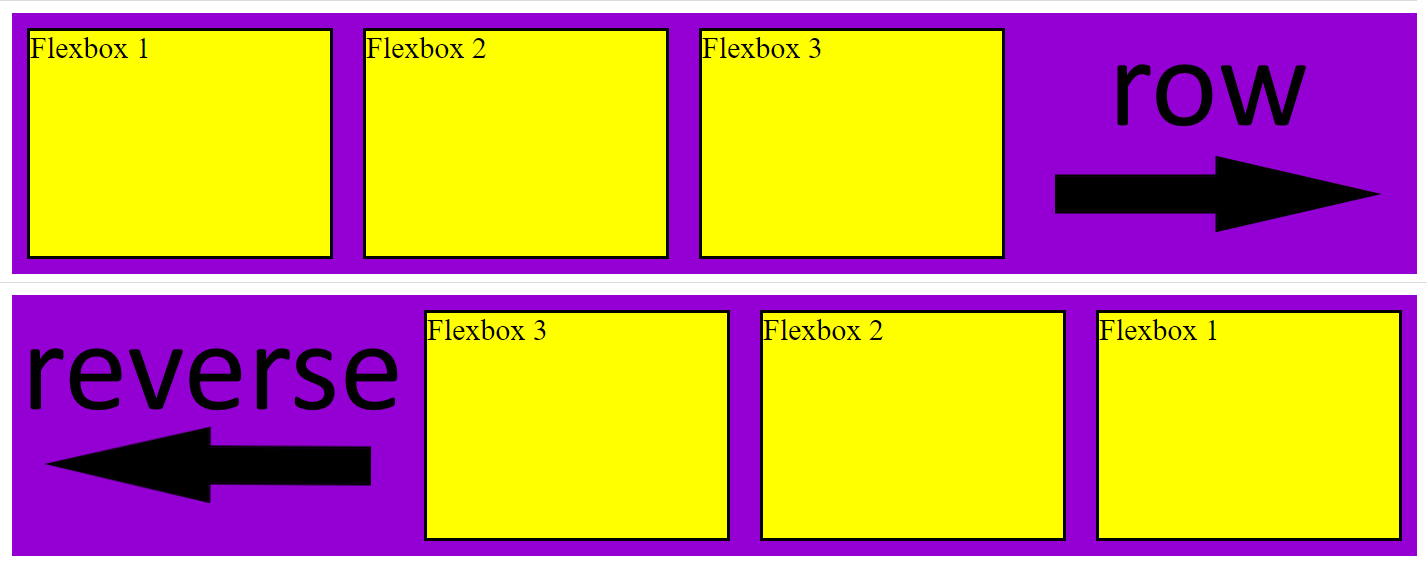
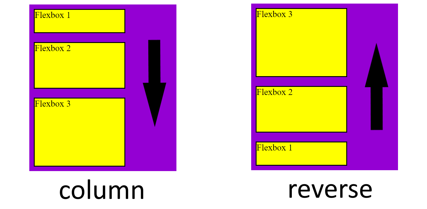
display attribute set to flex. The flexbox container also has a flex-direction attribute
that is set to row by default but can be changed to column, row-reverse, or
column-reverse. This determines the direction of the child elements in the flexbox.
                .container{
                    display: flex;
                    background-color: darkviolet;
                    flex-direction: row;
                }
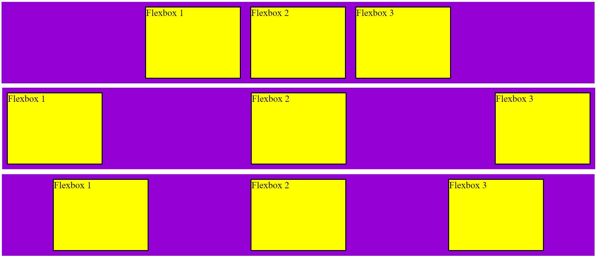
You can also set the justify-content attribute of the container to adjust how
the child elements are aligned. By default, the elements will stick to the left side of the container
(this attribute value is flex-start) but you can change this attribute to flex-end to
move the elements to the right, and center to move all the elements to the center. You can also
use space-between to set the distance between all items equal or space-around which gives
each item an equal amount of spacing on both sides.
                    .container{
                        display: flex;
                        background-color: darkviolet;
                        justify-content: center;
                    }
                    .container{
                        display: flex;
                        background-color: darkviolet;
                        justify-content: space-between;
                    }
                    .container{
                        display: flex;
                        background-color: darkviolet;
                        justify-content: space-around;
                    }
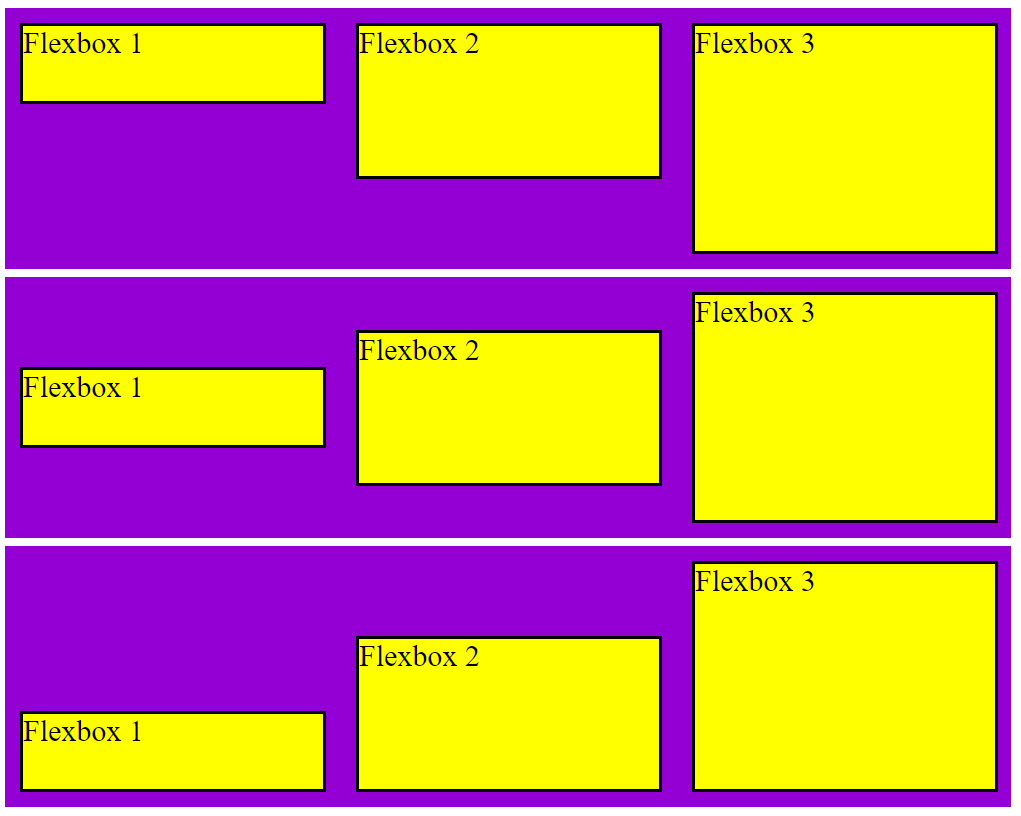
The align-items attribute of the container allows you to take control of the
vertical alignment of the flexbox items. By default, this attribute is set to stretch which
sets all items to the fill the most space vertically. This can be set to align at the top, bottom,
or center using flex-start, flex-end, and center.
                    .container{
                        display: flex;
                        background-color: darkviolet;
                        align-items: flex-start;
                    }
                    .container{
                        display: flex;
                        background-color: darkviolet;
                        align-items: center;
                    }
                    .container{
                        display: flex;
                        background-color: darkviolet;
                        align-items: flex-end;
                    }
This is a brief introduction to using flexbox to improve your CSS. There are other
unique applications of this feature that can really take your pages to the next level.